Powering
Precision
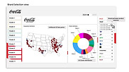
Marketing
Presentation ready dashboards & branding evolution
Brief
The task was to design a sophisticated and exploratory dashboard that is both intuitive and versatile. The goal was to create a tool that is not only functional but also visually appealing to non-data specialists, such as marketers and decision-makers.
Additionally, the design needed to align with Coca-Cola’s branding and vision, ensuring that the screens, slides, and extracts seamlessly integrate with the company’s presentations.
Coca-Cola branding examples


Early examination and drafts
First, we identified and organized the most efficient way to group information and content into the fewest wireframes possible. This approach ensures consistency and minimizes the user’s learning curve.


simplified early wireframes outlining the specs
Our initial design approach was minimalistic, emphasizing the efficient management of extended slicing and filtering variables on screen.

Early presentation of look and feel proposal

At this stage, the developing team decided to move forward independently
Returning to the project
After some time, we were asked to revisit the project because the initial wireframes were abandoned due to client needs and pressures. This led to a functional but confusing and inconsistent dashboard.
We streamlined the design by removing certain on-screen navigation options, allowing the application’s built-in navigation capabilities to take over.
Notes and suggestions on early prototype


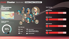
Collectibles
The next step was to create a visual language for the application/dashboard. Inspired by Coca-Cola’s iconic status in US culture and modern history, we drew inspiration from baseball cards and collectibles.
Notes and suggestions on early prototype


Embracing Gen AI
While the updated, cleaner structure was effective, initial testing feedback indicated that the classic look and feel did not reflect the cutting-edge technology behind the UI.
It also deviated from Coca-Cola’s Gen AI initiatives and its focus on youth and culture.
We redesigned the decorative elements, signage, and interface assets with a cleaner approach, leveraging Gen AI technology to generate clusters and incorporating a stronger influence from contemporary company branding.
Final asset and wireframe proposal