PDC
Brand evolution
A rocky start
When I joined Unilever’s People Data Centre, the branding was inconsistent and lacked variability across applications. There were no vector or high-resolution files of the existing logo, and no brand guidelines.
The PowerPoint templates were devoid of themes and featured diverse, inconsistent assets. The logo itself was a haphazard amalgamation of three logos, lacking thought and structure.
up to 2016 PDC Logotype and template

2016: The bubble
To address these issues, I aimed to create a more consistent, versatile, and dynamic brand image, while adhering to the restriction that the logo elements could not be significantly altered.
I introduced the bubble element to better explain the PDC’s role in listening to consumers, proposing insights, and informing stakeholder dialogue.
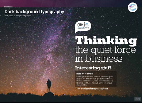
I designed a comprehensive brand book that provided solutions and guidance on all aspects of the brand, from color coding to image styles and iconography.

2016 BrandBook

2016 Video Ident

2018 Video Ident
Banners and area signage


2019: Tracking the change
This change in the PDC partnering logotypes sparked a new conversation on how to communicate the department’s identity to the broader company and external partners.
Exploring brand evolution during partner and parent rebrand

2021: Embracing the motherbrand
Following the company-wide rebranding, PDC and CMI had to evolve, which meant removing some individuality and uniqueness in applications but strengthening the CMI-PDC parent-child relationship.

2021 Logo
Identofying forms in Unilever branding to claim uniqueness

Embracing the diversion in the PDC templates
