+44 7707 527204 | yannis@mindfor.design
.png)
Challenge
When I joined, Unilever CMI/PDC's brand identity was a patchwork - literally. The logo was an uneasy assembly of three separate marks, each representing a different team, its size and placement dictated not by design logic but by internal politics: whoever had the most sway got the biggest lockup. There were no usage guidelines, no consistent application across decks, docs, or signage, and no single visual language tying the function together. The result was a brand that looked - and felt - fragmented from the inside out, undermining the credibility of a team meant to represent unified, data-driven insight.
.png)
The first move was to engulf the three competing logos under a single unifying idea - giving the identity structure and coherence, rather than three marks jostling for space. From there, the priority shifted to isolating PDC specifically, developing a visual language that was distinctly its own: a dedicated colour palette, refined typography, and a clear logo lockup, formalised into usage guidelines so it could scale consistently without being renegotiated by whoever was in the room.
Bubble and Book
The first move was to engulf the three competing logos under a single unifying idea, giving the identity structure rather than three marks jostling for space. A "bubble" was introduced as a backdrop, bringing balance to the patchwork, improving legibility and making the logo easier to apply consistently across contexts.
From there, PDC's brand was protected and elevated through a detailed brand book - codifying the colour palette, typography, and logo lockup into a formal usage framework. Under my guidance, the Design Lab became the brand's guardians, ensuring the identity was applied consistently rather than left open to reinterpretation.
.png)


.png)
.png)
.png)
Always on the move
The search for a more elegant solution never stopped. Beyond the static identity, I researched and proposed ideas for a moving, animated, modular logo system — branding that could flex and respond rather than sit fixed, keeping PDC's identity ready for whatever came next.

Evolution
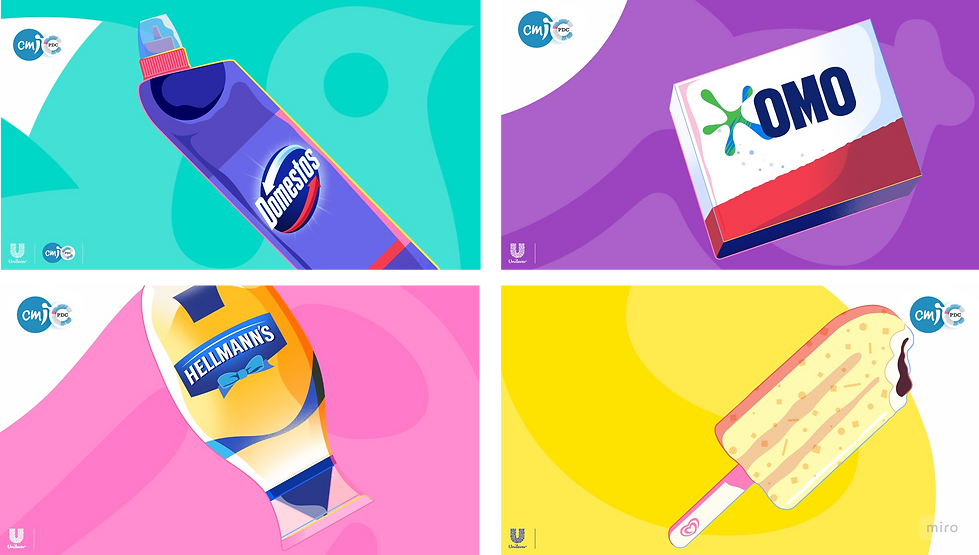
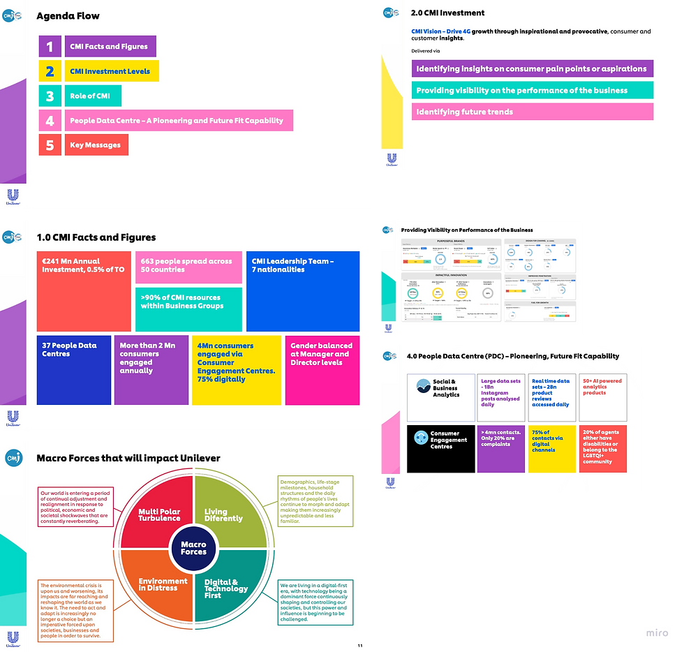
A few years on, a global Unilever rebrand forced further change, and PDC had to adapt in step. ETS was dropped from the logo, and the palette shifted to align with Unilever's new brand colours. To preserve design uniqueness within that constraint, I transformed the bubble into a white cut - a device representing PDC's departmental relationship to CMI, distinct yet clearly part of the same family.
.png)
.png)
The search for a more elegant solution never stopped. Alongside a fix to CMI's own logo — correcting a long-standing legibility issue where the lowercase "i" was often misread as a "j" — the CMI/PDC lockup was redesigned to better represent the relationship between the two. I researched and proposed a moving, animated, modular logo system, adding movement to create engagement and taking advantage of the company's shift toward paperless, digital-first communication.
